Struggling to make your product stand out on a crowded shelf? A packaging redesign1 can be the key to unlocking sales, but it's a daunting process. What if you lose the recognition you've worked so hard to build?
The secret is to evolve, not erase2. Successful redesigns balance brand history3 with modern needs. They focus on improving shopper experience4, clarifying the product's purpose, and ensuring the new design can be produced consistently and performs well in a retail environment.
I've seen firsthand how a thoughtful packaging refresh can transform a brand's trajectory. It’s not just about a new look; it's about connecting with your customer from the moment they see your product on the shelf. Let’s break down three examples of brands that nailed their packaging redesign1 and what we can learn from them.
Coca-Cola: Evolving an Icon Without Losing Recognition?
Worried that a packaging change will erase your brand's identity? Coca-Cola faced this challenge head-on. They needed to create a unified look across their different products without losing their iconic status that has been built over a century.
Coca-Cola's solution was to double down on its most recognizable assets. By creating a consistent design system that celebrated their famous red and iconic script, they made it easier for shoppers to find their favorite Coke, with or without sugar.
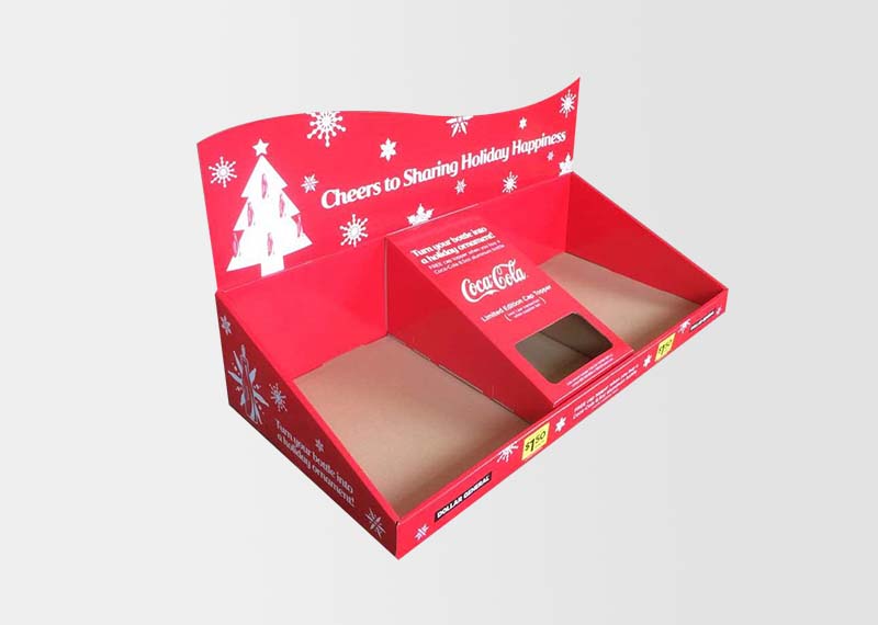
I’ve always admired how Coca-Cola manages to feel both timeless and modern. Their approach to packaging is a masterclass in brand stewardship. They understood that the goal wasn't to create something entirely new, but to clarify and strengthen what they already had.
Before & After Deep Dive
Before: The primary issue was a lack of consistency. Different variants like Diet Coke and Coke Zero had distinct designs, which diluted the main brand's power on the shelf. This could sometimes lead to customer confusion and a fragmented brand presence in stores.
After: The redesign brought all the variants under a single visual identity. The iconic Coca-Cola red disc was used across all packaging, with secondary colors to differentiate the products (black for Zero, silver for Diet). This "one brand" strategy created a powerful block of red on the shelf that is unmistakably Coke.
- Design Impact: The change was an evolution, not a revolution. By keeping the core elements like the Spencerian script logo5 and the color red, they maintained instant recognition. The new design hierarchy6 is cleaner, making it easier for shoppers to navigate the options.
- Production Impact: A unified design system simplifies production. Using a consistent red across the main brand allows for greater print consistency globally, ensuring that a Coke in the UK looks exactly like a Coke in the USA. This is a huge advantage for a global brand.
- Retail Impact: The result in stores is a stronger shelf presence. The unified look creates a "wall of red" that's easy to spot from a distance, improving brand visibility and making it simpler for retailers to create impactful displays. This strong packaging presence means that point-of-purchase (POP) displays7 don't need to work as hard to establish the brand; they can focus on promoting deals or new products.
The key lesson here is to identify your most powerful brand assets and make them the hero of your redesign.
ANZAC: Modernizing Packaging While Protecting Brand Equity?
Is your packaging starting to look a little dated? Oreo faced the challenge of refreshing its look to appeal to modern shoppers while holding onto the nostalgic feelings8 and brand equity it has built for over 100 years.
ANZAC successfully modernized its packaging by focusing on appetite appeal and the user experience. They kept their iconic blue color and logo but introduced high-quality, delicious-looking images of the cookie, often shown being dunked in milk, to make the product itself the star.

I remember when Oreo started updating their packaging. It was a subtle shift, but it made a big difference. The cookie looked more delicious, and the packaging felt more current. They managed to evolve without losing that classic Oreo feeling we all know and love.
Before & After Deep Dive
Before: While iconic, the older packaging was less focused on the product itself. The graphics were simpler, and it didn't have the same mouth-watering effect as competitors' packaging. As consumer preferences shifted towards more visually engaging products, Oreo needed to keep up.
After: The refreshed packaging puts the cookie front and center. The design is cleaner, with a clear hierarchy that emphasizes the Oreo logo and a tempting image of the cookie. They also introduced features like a resealable tab9, which improved the functionality and freshness of the product for the consumer.
- Design Impact: The new design has a much stronger appetite appeal. The high-quality photography makes the cookie look irresistible, which is a key driver for snack purchases. By keeping the core blue color and logo, they ensured the brand remained instantly recognizable.
- Production Impact: The design system is scalable across a huge variety of flavors and limited-edition releases. The consistent layout allows for easy adaptation, whether it's for a seasonal flavor or a partnership with another brand. This flexibility is crucial for a brand that relies on innovation to stay exciting.
- Retail Impact: The modernized packaging creates a stronger "brand block10" on the shelf. The consistent use of the vibrant blue helps Oreo stand out in a crowded cookie aisle. This visual consistency makes it easier to create effective POP displays that attract impulse buys. When your packaging clearly communicates what's inside, your displays can be simpler and more direct.
The lesson from Oreo is to protect your core brand assets while evolving the parts of your packaging that can better meet modern consumer expectations, like appetite appeal and functionality.
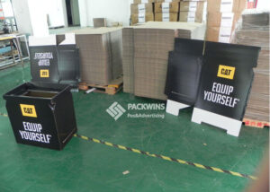
Cat Bin: A Functional Redesign That Drove Retail Clarity?
Is your packaging confusing customers at the shelf? This is a common problem for functional products where the use case isn't immediately obvious. Tidy Cats faced this issue with their lightweight cat litter, a product that solved a major customer pain point but needed to communicate its benefit clearly.
The redesign focused on one key message: this litter is half the weight of traditional litter. They used clear, bold graphics and an interactive in-store display11 to let customers feel the difference for themselves. This focus on functional clarity12 drove understanding and sales.

I saw one of these Tidy Cats displays in a store, and it was brilliant. They had the new lightweight jug next to an old, heavier one, and you could lift them both. It was a simple, powerful way to communicate the product's main benefit. It turned a mundane shopping trip into an interactive experience.
Before & After Deep Dive
Before: The problem wasn't the product, but the communication. Cat litter is heavy, and while Tidy Cats had an innovative lightweight solution, the original packaging didn't scream "easy to carry!" It looked like any other cat litter jug, so the primary benefit was lost on busy shoppers scanning the shelves.
After: The redesign centered on communicating the lightweight benefit. The packaging graphics were updated to be cleaner and more modern, with a clear call-out to the "LightWeight" feature. The structural design of the jug itself, often with improved handles, made it physically easier for the customer to handle.
- Design Impact: The design is now function-led. The primary goal is to communicate a key benefit, and every element of the design supports that goal. This clarity helps the customer understand the value proposition in the few seconds they spend looking at the shelf.
- Production Impact: While the product itself was innovative, the packaging redesign1 likely focused on optimizing materials to be both durable and lightweight. Structural improvements to the jug and handle could be made without drastically increasing production costs, providing a better user experience.
- Retail Impact: The redesign led to much clearer communication at the shelf. Interactive POP displays that allowed shoppers to compare the weight of the old and new packaging were a game-changer. This hands-on experience removed any doubt about the product's claim and drove trial. When packaging clearly communicates its benefits, it makes the retailer's job of selling it much easier.
The main takeaway here is that for functional products, your packaging's number one job is to clearly communicate how it solves the customer's problem.
Before vs After Packaging Redesign Comparison
| Brand | Key Before Issue | Redesign Focus | Retail Outcome |
|---|---|---|---|
| Coca-Cola | Inconsistent branding across product variants, causing potential shopper confusion. | Unifying the entire product line under the iconic Coca-Cola red for a consistent global system. | Stronger shelf presence, instant brand recognition, and easier navigation for consumers. |
| Oreo | Dated graphics with low appetite appeal that didn't showcase the product effectively. | Modernizing imagery to increase appetite appeal while preserving iconic brand elements like the blue color and logo. | Increased impulse buys, stronger brand block10ing on shelves, and a scalable design for new flavors. |
| Cat Bin (Tidy Cats) | Key product benefit (lightweight) was not clearly communicated on the packaging. | Function-led design and messaging to highlight the lightweight feature and improve consumer convenience. | Improved shopper understanding, better sell-through, and effective interactive retail displays. |
Conclusion
Successful redesigns evolve; they don’t erase. Brand equity is a powerful asset, not a limitation. These redesigns succeed because they align design, production realities, and the retail environment to create a better experience for the shopper.
Explore how a packaging redesign can enhance product visibility and sales, making your brand stand out on crowded shelves. ↩
Learn strategies to update packaging while maintaining brand recognition and customer loyalty. ↩
Understand the significance of incorporating brand history into new packaging to maintain brand equity. ↩
Discover how thoughtful packaging design can improve customer interaction and satisfaction in stores. ↩
Explore the historical and branding importance of Coca-Cola's iconic Spencerian script logo. ↩
Discover how design hierarchy can guide consumer attention and improve packaging effectiveness. ↩
Discover the role of POP displays in attracting consumer attention and boosting sales at retail locations. ↩
Learn how to balance modern design with nostalgia to retain customer loyalty and brand equity. ↩
Discover how resealable packaging can improve product freshness and consumer convenience. ↩
Understand how creating a brand block can improve shelf presence and product visibility. ↩
Explore how interactive displays can enhance customer experience and drive product trials. ↩
Learn how clear communication of product benefits can improve consumer understanding and sales. ↩

