Your packaging color looks great on screen but fails on the shelf. This disconnect can lead to retailer rejection1, lost sales, and wasted inventory. You need to understand the real color strategies of major retailers2.
Major retailers use specific, consistent color systems to drive sales and build trust. Success for importers means mastering not just color theory3, but also production standards4 like Pantone, CMYK5, and ensuring printing accuracy6 to meet strict retail compliance requirements7 and avoid costly rejections.

This isn't just about picking a pretty color from a swatch book. It's about building a system that works from the design file in the U.S. all the way to the printing press in China and onto the retail shelf. I've seen brands succeed and fail based on this process alone. Getting it right means your product flies off the shelf. Getting it wrong means it might not even make it there. Let's break down how the pros handle color, and how you can, too.
How do major U.S. retailers use color strategy to drive sales, trust, and repeat purchases?
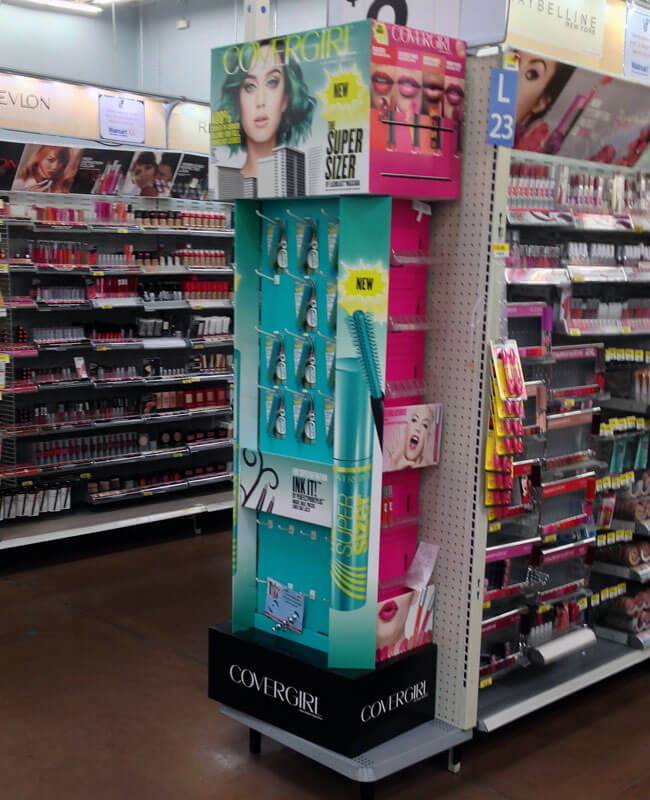
You see brands like Coca-Cola or Tide dominate the aisle. It's not just their logo. Their color consistency across all packaging and displays creates a powerful, trustworthy brand block8.
Retailers use color for category navigation9 (e.g., green for organic), brand recognition (Tiffany Blue), and triggering purchases. They enforce strict color standards to ensure this consistency, which builds shopper trust and simplifies buying decisions, ultimately boosting sales velocity and encouraging repeat business for compliant brands.

In my years of producing displays for U.S. retailers, I've learned that they think of color in very practical terms. It's a tool for business, not just an artistic choice. They know that shoppers are in a hurry and make decisions in seconds. Color is the fastest way to communicate information.
Beyond Emotion: Color as a Navigational Tool
Retailers use color to organize their stores and help customers find what they need quickly. Think about the organic section at a grocery store; it's almost always dominated by greens and earth tones. This isn't an accident. It's a visual shortcut that tells shoppers, "This is the natural and healthy section." If your natural food product is packaged in neon pink, it will look out of place and shoppers may unconsciously skip over it, assuming it doesn't belong. Your color choice signals where you fit in.
The Brand Block and Shelf Impact
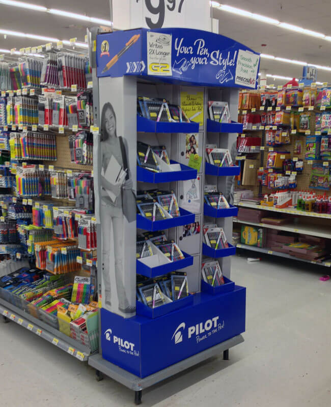
When a brand uses a single, powerful color consistently, it creates what we call a "brand block8." From 20 feet away, a shopper can spot the Home Depot orange or the Costco red. This makes your brand instantly recognizable and easy to find. It turns your section of the aisle into a mini-billboard. This is why retailers demand color consistency across your product packaging, your shelf-ready PDQs, and even your pallet displays. It all has to match.
| Retailer Goal | Color Strategy Example | B2B Implication for Your Brand |
|---|---|---|
| Category Navigation | Whole Foods uses green/earth tones for organic aisles. | Your packaging color must align with category norms to be seen as credible. |
| Brand Recognition | Target's red is used on signage, displays, and private-label packaging. | A consistent brand color makes you easy to find and builds shopper memory. |
| Urgency & Promotion | Yellow and red are used for "Sale" or "Clearance" signs. | Your display colors must complement, not clash with, in-store promotional colors. |
As a brand or importer, your job is to choose a color that not only represents your brand identity but also works within this established retail system.
What's the commercial psychology behind retail packaging colors, and why must importers align with it?
You chose a vibrant color for your new product. But is it the right color for the U.S. market, the product category, and the retailer's unwritten rules? A mismatch can be disastrous.
Commercial color psychology isn't about what's "pretty." It's about meeting established consumer expectations within a specific category. For example, black signals luxury in cosmetics, while blue conveys trust in tech. Aligning with these codes ensures your product feels appropriate and trustworthy to shoppers.
The key word here is "commercial." We are not talking about personal preference. We are talking about learned associations that drive sales in a fast-paced retail environment. I once worked with a European snack brand trying to enter the U.S. market. They used a muted, pastel green that was popular in their home country. But in the U.S. snack aisle, surrounded by bright reds, oranges, and yellows, their product looked faded and unappetizing. It simply didn't communicate "tasty snack." They failed to align with the category's color language.
Category Color Codes
Every product category has its own set of unwritten color rules. Breaking these rules is a huge risk unless you have a massive marketing budget to re-educate consumers. For most brands, it's smarter to work within the existing framework.
Market and Retailer Alignment
These color codes can even vary by retailer. A product designed for Walmart, which emphasizes value, might use bold, primary colors. The same product on the shelves of a premium retailer like Williams-Sonoma might need a more subdued, sophisticated color palette to look like it belongs.
| Product Category | Common U.S. Color Association | Commercial Rationale & Importer Takeaway |
|---|---|---|
| Food & Beverage | Red (appetite), Green (natural), Blue (freshness), Yellow (fun) | Your color must communicate the taste profile. Mismatched colors can make food seem unappealing. |
| Beauty & Cosmetics | Black/Gold (luxury), White/Pink (clean, gentle, feminine) | Color instantly signals the price point and target demographic before a customer even reads the label. |
| Electronics | Blue (trust, reliability), Black/Silver (premium, modern) | These colors build confidence in a high-cost purchase and suggest cutting-edge technology. |
| Cleaning Supplies | Green (eco-friendly), Blue (freshness), Orange (heavy-duty) | The color tells the customer the product's primary benefit: is it natural, does it smell fresh, or is it powerful? |
As an importer, you must research these category codes in the U.S. market. Don't assume what works in one country will work in another. Your color choice is the first signal to a potential buyer, and getting it wrong means you've lost the sale before they even pick up the box.
How do packaging color choices impact manufacturing cost, lead time, and import risk from China?
Your design uses a beautiful custom gradient. Your factory in China says it will add weeks to the lead time and increase costs by 20%. Now what? This is a conversation I have almost every week.
Complex colors, gradients, and a high number of spot colors dramatically increase manufacturing costs and lead times. They require more press setup time, special custom-mixed inks, and slower press speeds to get right. This complexity also raises the risk of color inconsistency, which can lead to rejected shipments.
The choices made in a design studio in New York have real, tangible consequences on the factory floor in Shenzhen. I remember a client who insisted on a very specific metallic gold for a cosmetics display. The first batch we produced was perfect. The second, however, was slightly off—the ink supplier had a minor variation. The U.S. retailer's quality control team caught it immediately and rejected the entire shipment of 5,000 displays. We had to reprint everything, which cost our client six weeks in lost sales and tens of thousands of dollars in rework and air freight. The problem wasn't the design; it was a failure to plan for the realities of mass production.
CMYK vs. Pantone10 (Spot) Colors
- CMYK (Cyan, Magenta, Yellow, Black): This is four-color process printing. It's great for photographic images but can be inconsistent for solid brand colors. The same color can look different from one print run to the next. It's cheaper for complex images.
- Pantone/Spot Colors: These are pre-mixed inks for a specific color. Using a Pantone color ensures your brand's red is the exact same red every single time. It's the standard for brand logos and critical color elements. However, each Pantone color adds another plate to the printing press, increasing setup time and cost.
The Hidden Costs of Complexity
| Color Choice Factor | Impact on Cost | Impact on Lead Time | Import Risk |
|---|---|---|---|
| Number of Colors | High. Each additional color, especially a spot color, requires a new printing plate and more press time. | High. More colors mean a longer, more complex setup and slower run speeds. | Medium. Risk of one color being out of alignment or misprinted. |
| CMYK Process | Low. Standard four-color setup is efficient. | Low. It's a fast, standard process. | High. High risk of color variation between print runs, which can lead to rejection. |
| Pantone (Spot) Colors | Medium-High. Ink is more expensive, and each color adds to the setup cost. | Medium. Requires specific ink mixing and press wash-ups between colors. | Low. The best way to ensure exact color matching and consistency. |
| Gradients/Metallics | Very High. Requires expert press operators and often much slower speeds to avoid banding or inconsistencies. | Very High. These are the most difficult effects to get right, requiring multiple tests and slow runs. | Very High. Highest risk of rejection due to inconsistencies that are very visible to the eye. |
As a rule of thumb, for maximum consistency and minimal risk, use as few Pantone colors as possible to represent your core brand. Use CMYK for everything else. This simple decision can save you thousands of dollars and weeks of delays.
What should U.S. importers know about color standards, printing accuracy6, and retail approval?
Your samples looked perfect. But the final production run is 5% off your brand's core blue. Will Walmart or Costco notice? The answer is a definite yes, and it can be a very expensive problem.
Importers must define color standards using physical Pantone swatches, not just digital screen values. You need to specify an acceptable tolerance (known as Delta E11) and require your factory to use a spectrophotometer12 for quality control. Retailers audit this, and failure means rejection at your own expense.
A brand's color is its asset. Retailers know this, and they have systems to protect it. Relying on "it looks good to my eye" is the fastest way to get a shipment rejected. I had a project for a major hardware brand. Their brand red had to be perfect. We sent three rounds of physical color drawdowns on the actual cardboard stock to their U.S. headquarters for approval before we even started the main press run. It added a week to the pre-production timeline, but it prevented a potential six-figure rejection. The process is your insurance policy.
Defining "Correct": Moving Beyond Subjective Opinion
You cannot manage color quality through email or by looking at a computer screen. Every screen is different. The only way to do it is with physical standards.
- Pantone Book: This is your bible. You and your factory must be using the same, up-to-date Pantone book (they fade over time).
- Delta E11 (ΔE): This is the numerical value that measures the difference between two colors. A Delta E11 of 0 means a perfect match. Most brands and retailers require a Delta E11 of 2 or less. This is not something you can see with your eye; it requires a machine.
The Proofing and Approval Process
A professional color approval process must be part of your production plan.
- Digital Proof: A quick check for layout and text, not for color accuracy.
- Physical Drawdown: The factory prints your Pantone color on the actual substrate (e.g., Kemi board, CCNB) that will be used for your job. You approve this physical sample.
- First-Article Inspection: The first piece off the main production press run is pulled and compared against your approved drawdown sample. Production does not continue until this is signed off.
- Ongoing QC: The factory should use a spectrophotometer12 to check color every 500 or 1,000 sheets during the run to ensure it doesn't drift.
This process removes all subjectivity and protects you from a factory that might try to use a cheaper, "close enough" ink. It creates a paper trail of approvals that proves you met the required standard.
How can a China-based packaging partner13 help U.S. brands execute retail-proven color systems?
You're trying to manage color quality with a factory 12 time zones away. Miscommunications, language barriers, and delays are piling up. There has to be a better, safer way to ensure quality control.
A good China-based packaging partner13 acts as your on-the-ground team. We manage the entire color process, from sourcing the correct materials and inks to overseeing press checks14 and conducting pre-shipment inspections15. This eliminates miscommunication, ensures compliance with U.S. retail standards, and prevents costly errors before they ship.
Trying to manage a complex print job from the U.S. is like trying to fly a plane by radio instructions alone. You can't see what's happening. You can't walk over to the press and see the color for yourself. A local partner like us is your set of eyes and hands in the factory. We are fluent in the language of printing and the culture of manufacturing in China. We know the shortcuts that factories sometimes take, and we know how to prevent them.
Bridging the Communication and Culture Gap
When you send a technical specificati
Understanding the reasons behind retailer rejection can help you avoid costly mistakes and ensure your product reaches the shelves successfully. ↩
Explore how major retailers use color strategies to enhance brand recognition and drive sales, and how you can apply these tactics. ↩
Understanding color theory can help you make informed decisions about your packaging design to align with retail standards. ↩
Learn about the production standards required for retail packaging to ensure compliance and avoid rejections. ↩
Learn how Pantone and CMYK color systems impact your packaging design and why choosing the right one is crucial for retail success. ↩
Discover why printing accuracy is vital for maintaining brand consistency and meeting retailer standards, preventing costly rejections. ↩
Understanding retail compliance requirements can help you design packaging that meets retailer expectations and avoids costly rejections. ↩
Learn how creating a brand block can make your product stand out on the shelf and boost brand recognition. ↩
Discover how retailers use color for category navigation to enhance the shopping experience and how your brand can fit into this system. ↩
Understanding the pros and cons of CMYK vs. Pantone colors can help you make informed decisions about your packaging design. ↩
Learn about Delta E and its importance in ensuring color consistency and quality in retail packaging. ↩
Discover how a spectrophotometer ensures color accuracy and consistency in packaging, preventing costly rejections. ↩
Explore how a China-based packaging partner can ensure quality control and compliance with U.S. retail standards. ↩
Understand the importance of press checks in maintaining color accuracy and quality during packaging production. ↩
Learn how pre-shipment inspections can prevent costly errors and ensure your packaging meets retailer standards. ↩


