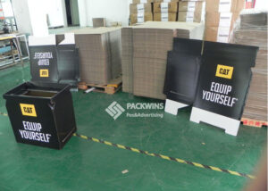
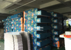
Your brand's color is everything on a crowded retail shelf. Get it wrong, and you blend in. Get it right, and you stand out. But ensuring that perfect color match across thousands of displays feels impossible, doesn't it?
Spot color printing%%%FOOTNOTE_REF1%%% uses pre-mixed inks, like the [Pantone Matching System (PMS)](https://www.pantone.com/color-systems/pantone-color-systems-explained?srsltid=AfmBOorOSgh05U7Cjd2TK2aDIbcgu1T8l259LVunAtKR-Ju2iaVw9kb)2, to produce exact, consistent colors. It's ideal for logos and brand-specific shades on corrugated POP displays3, ensuring your brand looks identical from store to store, something CMYK's four-color mix4 can't always guarantee.
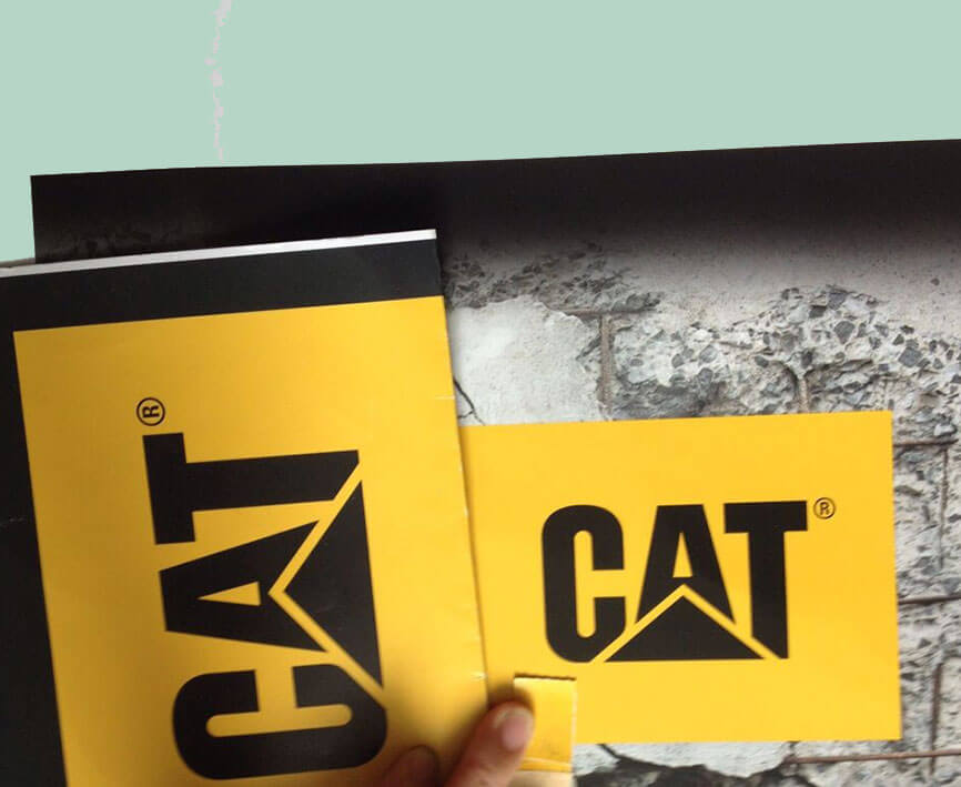
I’ve seen countless brands struggle with color consistency in retail5. They sign off on a beautiful digital proof, only to see their floor displays in Walmart or Target look washed out or just… off. This inconsistency undermines brand recognition6 at the most critical moment—the point of purchase. But there is a way to control this, a method the biggest brands rely on for their most important asset: their color. Let’s dive into how spot color printing can solve these problems and drive retail performance.
What Is Spot Color Printing in Packaging?
Struggling to make your brand color pop on cardboard? You've likely noticed that what looks vibrant on screen can appear dull on a physical display. This inconsistency can weaken your brand's presence in a competitive retail environment.
Spot color printing1, often using the Pantone (PMS) system, involves using a single, pre-mixed ink for each specific color in your design. Unlike CMYK, which creates colors by mixing dots of Cyan, Magenta, Yellow, and Black, a spot color is a solid, uniform layer of ink. This method delivers unmatched color accuracy and consistency7, which is crucial for brand logos on retail POP displays3.
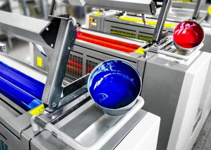
When I work with brand managers preparing for a major retail launch, their biggest fear is inconsistency. Imagine your iconic red looking slightly orange on an endcap display in one state and a bit faded on a pallet display in another. This is where spot color printing becomes our most valuable tool. For corrugated displays, CMYK is great for photographic images, but for that specific, non-negotiable brand color, spot color is king. It's a pure, solid ink application that ensures your Coca-Cola Red or Tiffany Blue8 is perfect every single time, no matter the production run. This method eliminates the variables that can cause color shifts in CMYK printing, like dot gain and ink density variation on absorbent corrugated material. It’s the ultimate guarantee of brand integrity at the shelf9.
Why Do Brand Colors Matter More on POP Displays?
Ever walk down a busy "action alley" in Costco? Dozens of brands are screaming for attention. If your display's color is even slightly off, it fails to connect with shoppers who recognize your brand in fractions of a second.
On a POP display, brand color is the primary visual cue that triggers recognition from a distance. Under harsh retail lighting and amidst competitor clutter, the exact shade of your brand color ensures immediate identification and reinforces trust, which is something CMYK variations can compromise.

I remember a project for a beverage company whose signature green was their biggest asset. We did a test run with CMYK on a corrugated floor display, and under the fluorescent lights of the test store, the green looked sickly and washed out. The client was horrified. We immediately switched to a custom-mixed Pantone spot color. The difference was night and day. The display popped, the green was vibrant and correct, and it matched their packaging perfectly. This experience taught me a vital lesson: POP displays3 aren't just signs; they are physical extensions of the brand. Color consistency across all marketing channels can increase revenue significantly because it builds trust and familiarity. For a brand manager, ensuring that color is perfect on a display is just as important as the product inside the box.
When Does Spot Color vs CMYK Make Sense?
Choosing the right printing process feels complicated. You want perfect color, but you're also managing a budget. How do you decide between spot color and CMYK without sacrificing quality or overspending on your corrugated displays?
Use spot color for designs with one to three critical colors, like logos and brand elements, where accuracy is non-negotiable. Choose CMYK for full-color photographic images or designs with many colors and gradients. For high-volume POP display runs, spot color is often more cost-effective for simple, bold graphics.

Let me break this down from a manufacturing perspective. When we run a job with spot colors, we create a separate printing plate for each color. This has a higher initial setup cost. However, for a large run of 5,000 floor displays that only use two brand colors, the per-unit cost becomes very low and the color is perfect every time. Conversely, running a complex, photo-realistic image with CMYK requires four plates (C, M, Y, K) but can reproduce a wide spectrum of colors. The key is to analyze your artwork. Is the most important element your precise brand color? If yes, spot color is the safer, more professional choice. If you're printing a lifestyle image across the entire display, CMYK is the way to go. Sometimes, we even combine them—using CMYK for the image and adding a fifth spot color plate for the logo to get the best of both worlds.
How Does Spot Color vs Digital Printing for POP Displays Compare?
You need a few prototypes for a buyer meeting next week, but you also need to plan for a 10,000-unit rollout next quarter. These two needs require different printing methods, and choosing the wrong one can be costly and slow you down.
Digital printing is perfect for samples, prototypes, and small production runs because it has low setup costs and is fast. Spot color (on an offset or flexo press) is built for scale, offering the lowest unit cost and perfect color consistency for large, high-volume rollouts.

Here at Packwins, this is our daily workflow. A brand manager for a water bottle company will send us a design for a new sidekick display. We'll produce five units using our high-end digital printer. These printers are CMYK-based but can simulate Pantone colors with very high accuracy, which is perfect for proofs. The brand manager can take these prototypes to their meeting with Target. Once the buyer approves the display and places a large order, we transition to offset printing with spot colors for the mass production run. This hybrid approach provides the best of both worlds: speed and flexibility upfront with cost-efficiency and absolute color precision at scale. Digital printing is not designed for the cost pressures of a massive retail rollout; the per-unit cost remains high. Spot color printing1 is built for that volume.
What Is the Cost Impact of Spot Colors on Corrugated Displays?
You've been told spot color is "more expensive," but that's not the whole story. You need to understand how the costs break down to budget effectively for your POP display campaign, especially when producing at scale.
The primary costs for spot color printing are the printing plates and machine setup fees for each color. While this makes small runs expensive, the per-unit cost drops dramatically on large orders as these initial expenses are spread across thousands of displays.
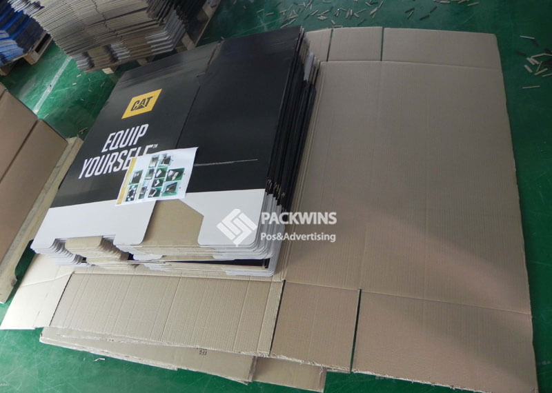
I always walk my clients through the numbers. Let’s say a project requires two spot colors. The setup cost, including making two printing plates, might be $1,000. If you only order 100 displays, you're adding $10 to the cost of each one just for setup. But if you order 5,000 displays, that setup cost becomes only $0.20 per unit. This is the power of economies of scale in manufacturing. When you're sourcing from China with a partner like us, these high-volume runs become incredibly efficient. The material and labor costs are optimized, and the precision of spot color printing reduces waste and reprints, further saving money. A brand manager trying to hit a specific cost-per-unit for a Walmart campaign needs to think in terms of volume. For large rollouts, spot color is not only the best quality choice but often the most economical one.
What Are Common Use Cases: Logos, Icons, and Retail Callouts?
You know spot color is precise, but where should you actually use it on your display? Applying it strategically is key to maximizing impact without overcomplicating production. The goal is to draw the shopper's eye to the most important elements.
Spot colors are best used for critical brand assets like logos and icons to ensure perfect consistency. They are also highly effective for retail callouts10, such as bright red or yellow "Sale" or "New" bursts, and for specific sustainability icons where color standards matter.

Think about the visual hierarchy on a busy retail floor. What does a shopper see first? A logo. That's why we always recommend printing logos in a spot color. It’s your brand’s signature. Next, think about the shopper's mission. If it's a value-driven purchase, a sharp, vibrant red callout printed with a spot color will cut through the noise far better than a CMYK approximation. I've also seen a rise in brands wanting to highlight their eco-credentials. Using the correct green Pantone for a recycling or sustainability logo shows attention to detail and reinforces the brand's message. It’s about using the precision of spot color to communicate key messages instantly and effectively, guiding the customer's eye and their purchasing decision.
How Does Packwins Execute Spot Color Displays at Scale?
It's one thing to understand the theory, but how do you ensure that Pantone 185C looks perfect on 20,000 displays manufactured overseas? The key is rigorous process control, from ink mixing to final press checks.
At Packwins, we use advanced spectrophotometers to digitally verify ink formulas before production. Our process includes controlled lighting environments for visual matching, sending physical proofs for approval, and maintaining strict press calibration routines to ensure color consistency across massive production runs for our retail clients.

When a U.S. brand manager partners with us, they're trusting us with their brand's integrity. We take that responsibility very seriously. Our color lab is the heart of this process. We don't just "eyeball" the color. We receive the client's Pantone code and create a custom ink mix. We then print a sample on the exact corrugated substrate that will be used for the final display and mail it for physical sign-off. Once approved, that ink formula is logged, and our presses are calibrated to that exact standard. Throughout the run, we perform quality control checks to ensure there is no color drift. This meticulous process, combined with the cost advantages of manufacturing in China, allows us to deliver large-scale POP display rollouts that are both color-perfect and budget-friendly.
What Do Retailer Color Compliance and Buyers Expect?
Getting your display into a major retailer is only half the battle. You have to meet their strict visual and structural standards. A display with off-brand colors can be rejected by a store manager, costing you thousands.
Major retailers like Walmart, Costco, and Target expect POP displays3 to meet high visual standards, where brand color consistency is a key component. Buyers approve displays based on prototypes that set the expectation for quality; spot color printing ensures the final rollout matches the approved proof exactly.
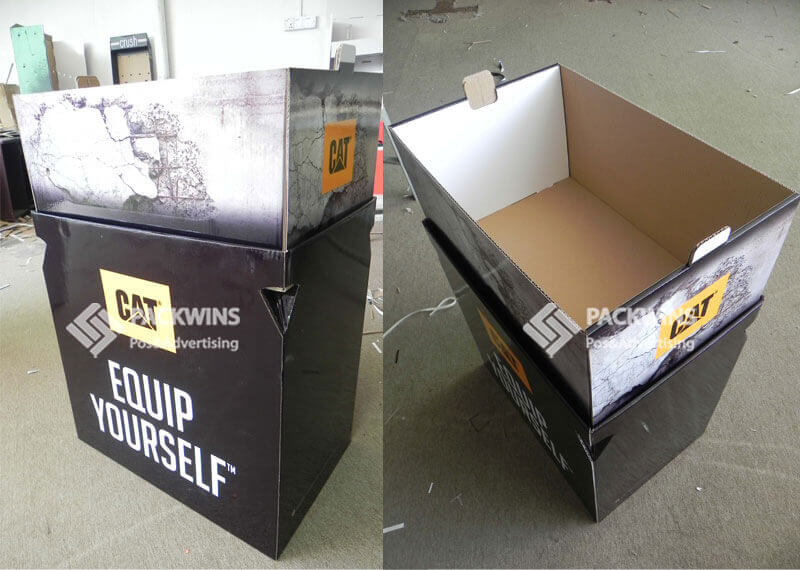
I've been in meetings where a retail buyer compares a production display to the initial prototype. If the color on a pallet display for Costco doesn't perfectly match the brand color on the product packaging itself, it creates a disconnected, unprofessional look. Retailers see this as a reflection of the brand's quality control. They want displays that are vibrant, professional, and consistent because it makes their stores look better and helps sell products. Using spot colors is a way of signaling to buyers that you are a professional partner who understands the importance of brand standards. It removes the risk of color variation and ensures that what they approve is exactly what will appear on their sales floor, leading to smoother approvals and a better retailer relationship.
When to Choose Spot Color Checklist:
- Is your brand logo or a specific brand color the most important part of the design? (If yes, use spot color).
- Does your design have 3 or fewer colors? (If yes, spot color is likely more cost-effective at scale).
- Are you printing a very large quantity (e.g., over 1,000 units)? (If yes, spot color offers great value).
- Is exact color matching across different print runs and materials critical? (If yes, spot color is the only way).
- Does your design include metallic or fluorescent colors? (If yes, you must use spot color).
Comparison Table: Spot Color vs CMYK vs Digital (Corrugated POP Displays)
| Factor | Spot Color (Pantone) | CMYK Offset | Digital Printing |
|---|---|---|---|
| Color Accuracy | ⭐⭐⭐⭐⭐ Exact brand match | ⭐⭐⭐ Good, can shift | ⭐⭐⭐⭐ Very good |
| Brand Consistency | Excellent across runs | Medium | High (file-based) |
| Setup Cost | Higher (plates, setup) | Medium | Low |
| Unit Cost (High Volume) | Lowest at scale | Low | High |
| MOQ Suitability | Medium–High | High | Very Low |
| Best Use Case | Logos, brand colors, retail icons | Full-image graphics | Samples, prototypes, short runs |
| Corrugated POP Fit | ⭐⭐⭐⭐⭐ | ⭐⭐⭐⭐ | ⭐⭐⭐ |
| Retail Buyer Approval | Very High | High | Medium |
Conclusion
In the end, choosing the right printing method comes down to protecting your brand. Spot color printing offers the ultimate control, ensuring your brand's most vital asset—its color—is perfect every time.
Spot color printing ensures exact color matching, crucial for maintaining brand integrity across retail displays. ↩
The Pantone Matching System provides precise color standards, essential for consistent brand representation. ↩
POP displays are crucial for attracting consumer attention and reinforcing brand identity in retail settings. ↩
CMYK can lead to color variations, affecting brand consistency and recognition in retail environments. ↩
Color consistency strengthens brand recognition and trust at the point of purchase, impacting sales. ↩
Consistent colors enhance brand recognition, making it easier for consumers to identify products quickly. ↩
Spot color printing uses solid ink layers for precise color matching, vital for brand logos and elements. ↩
Maintaining specific brand colors ensures brand integrity and consumer trust across different locations. ↩
Spot color printing eliminates color shifts, ensuring brand colors are consistent and recognizable. ↩
Retail callouts like 'Sale' tags draw consumer attention, benefiting from precise spot color printing. ↩


