Your package redesign1 looks great in the boardroom, but will it survive the shelf? Many redesigns fail, costing millions and confusing loyal customers who can no longer find your product.
Successful package redesign1s win at the shelf, not just in presentations. They achieve this by focusing on execution just as much as creativity, ensuring the final product performs under real retail conditions2 and aligns perfectly with in-store strategy.

I've seen countless redesigns pitched with beautiful mockups, only to fall flat in the chaotic reality of a retail store. A design that looks pristine on a screen can disappear on a poorly lit shelf, get lost among competitors, or simply fail to connect with a shopper in the three seconds you have to grab their attention. The truth is, a redesign's success is determined by a series of small, critical decisions made long before it ever hits the production line. It's about understanding the unforgiving environment of retail and designing for that reality from day one.
Do They Improve Recognition in the First 3 Seconds?
You've changed your look, but now your loyal customers can't find you. A dramatic redesign risk3s alienating the very people who keep your brand alive, sending them to competitors.
Winning package redesign1s strengthen instant recognition rather than forcing shoppers to relearn the brand. They evolve familiar visual cues4, making the product instantly findable for existing customers while attracting new ones.
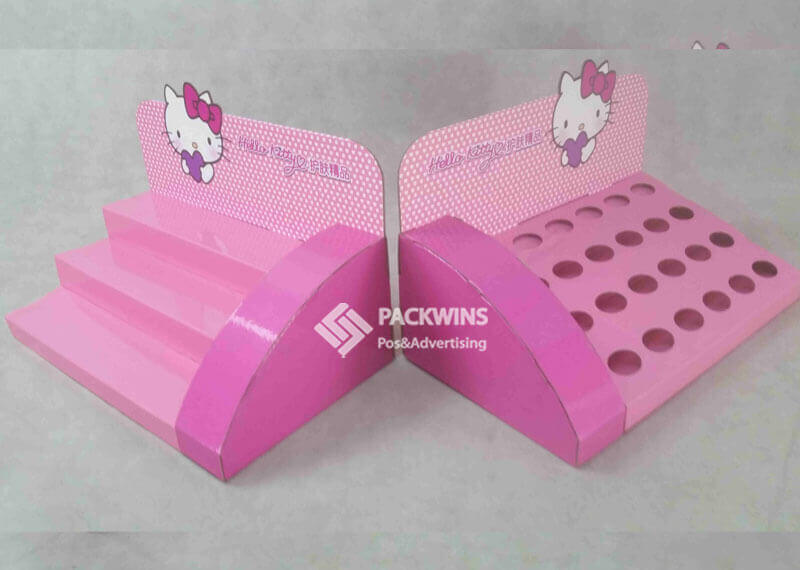
I once worked with a snack food brand that was eager to modernize its packaging. The initial designs were beautiful—clean, minimalist, and trendy. But in doing so, they stripped away the slightly dated but highly recognizable color blocking and logo placement that their customers had known for years. We had to pull back and re-integrate those core elements in a refreshed way. The final design felt new yet familiar, a crucial balance for on-shelf success. This principle holds true across industries; whether it's the unique bottle shape of a beauty product or the trusted color palette of a CBD oil, recognition is your most valuable asset during a redesign. A POP display5 that uses those same familiar cues can amplify this, creating a powerful brand block6 that guides shoppers' eyes directly to your product.
- Design Risk: The biggest mistake is an "over-redesign7" where you abandon core visual assets that your customers use to find you. Chasing trends can lead to a design that, while aesthetically pleasing, erases years of built-up brand equity.
- Production Risk: Subtle but critical brand elements, like a specific color shade or an embossed logo, can be lost during mass production. If your production partner isn't precise, the final product on the shelf might not match the approved design, weakening those recognition cues.
- Retail Risk: The ultimate failure is when shoppers walk right past your newly designed package because they don't recognize it. This is especially dangerous in impulse-driven categories like snacks and beverages, where a moment of hesitation can mean a lost sale.
Do They Clarify the Product Message Without Adding Noise?
Your new package is covered in claims, icons, and bursts, but shoppers are just confused. Overloading the design with information overwhelms consumers and obscures the one thing they need to know.
Successful redesigns simplify messaging so shoppers immediately understand what the product is and why it matters. They prioritize a clear visual hierarchy8 that communicates the most important benefit in a single glance.

In the CBD space, clarity is everything. I remember a client whose original packaging was filled with technical jargon and complex benefit callouts. Shoppers were intimidated and unsure of what the product actually did. For the redesign, we focused on a single, primary message: "Calm." We made that word the hero, supported by a clean layout and simple iconography. The result was a package that instantly communicated its core benefit, building trust with consumers who were new to the category. This applies to beauty products promising a specific result or a snack brand highlighting its organic ingredients. Your packaging's job is to make the purchasing decision easier, not harder. A well-designed corrugated display can support this by using simple, bold headlines that echo the package's primary message, reinforcing it from ten feet away.
- Design Risk: The temptation to cram every feature and benefit onto the front of the pack leads to a cluttered, confusing design. Without a clear hierarchy, shoppers don't know where to look and will move on.
- Production Risk: Fine print, intricate icons, or delicate fonts that look sharp on a designer's monitor can become illegible mush on a printing press. This is especially true in high-speed, high-volume production runs.
- Retail Risk: A confused shopper rarely buys. If your packaging forces a consumer to stop and decipher your message, you've likely lost them to a competitor with a clearer, more direct proposition.
Do They Strengthen Brand Assets Instead of Replacing Them?
In an effort to look new and fresh, you've thrown out the very elements that made you recognizable. Discarding valuable brand assets9 is a costly mistake that erases years of marketing efforts.
Winning redesigns evolve brand assets9 like logos, colors, and mascots instead of discarding familiar elements. They identify what's working and modernize it, maintaining a consistent brand story for loyal customers.
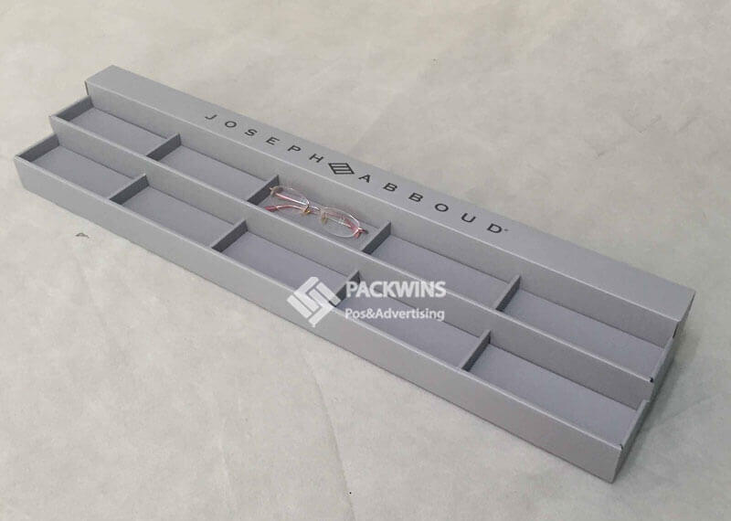
Think about iconic snack brands; they rarely undergo revolutionary changes. Instead, they make subtle tweaks over time—sharpening a logo, brightening a color palette, or updating a character's illustration. I worked with a legacy beauty brand whose packaging felt dated. The design team's first instinct was a complete overhaul. However, consumer research10 showed that their unique crest logo and signature deep blue color were deeply associated with trust and quality. The winning redesign kept these core assets but placed them in a cleaner, more modern layout with updated typography. It signaled an evolution, not a replacement. This continuity is vital, especially in big-box stores like Target or Walmart, where your product line might be spread across multiple SKUs and shelf sections. Consistent assets create a unified brand block6 that's easy for shoppers to spot.
- Design Risk: Chasing a fleeting design trend at the expense of your established brand identity is a common pitfall. The goal should be to refresh, not to become unrecognizable.
- Production Risk: Inconsistency across a product line is a major risk. Different print runs or packaging formats (e.g., a box vs. a pouch) can result in slight variations of your brand color, weakening the overall brand block6 on the shelf.
- Retail Risk: When a redesigned product line looks disjointed, it confuses shoppers and looks messy on the shelf. This brand discontinuity can erode trust and make it harder for customers to find their favorite items.
Do They Differentiate Structurally, Not Just Visually?
Your flat, rectangular box looks exactly like every other box on the shelf. A simple graphic refresh isn't enough to capture attention in a sea of similar products.
Structural changes often outperform graphic tweaks by creating a unique physical presence that improves visibility and shelf blocking. A distinctive shape can become a powerful brand asset in itself.
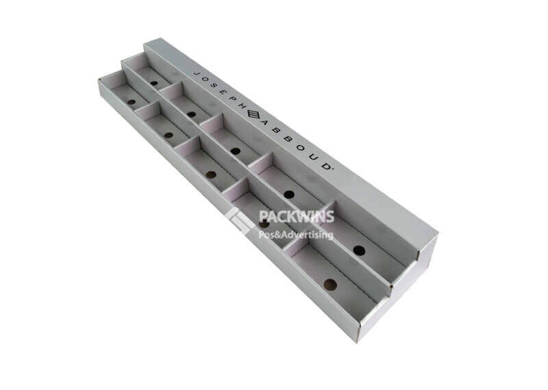
I saw a perfect example of this with a snack brand trying to break into the crowded chip aisle. Instead of another standard bag, we developed a cylindrical canister. It wasn't just different; it was more durable, easier to hold, and stacked perfectly on shelves. This structural innovation made them instantly stand out. In the beauty category, a unique bottle shape or dispensing mechanism can signal luxury and innovation. Even in big-box retail, where efficiency is key, a well-designed shelf-ready corrugated tray that creates a unique shape on the pallet can be a game-changer. These structural elements are harder for competitors to copy than a simple color or font change, giving you a more defensible market advantage. The structure itself becomes part of the brand experience.
- Design Risk: Relying solely on new graphics is a missed opportunity. A "flat" redesign that ignores the physical form of the package is less likely to stand out in a three-dimensional retail environment.
- Production Risk: Increased structural complexity can lead to higher production costs and potential manufacturing challenges. It's crucial to balance innovative design with practical, scalable production methods.
- Retail Risk: A poorly designed structure can be a nightmare at the shelf. If it's unstable, difficult to stock, or doesn't fit properly within the planogram, retailers may be hesitant to carry it, no matter how good it looks.
Are They Designed for Real Retail Conditions, Not Mockups?
The design was approved based on a flawless 3D render, but on the actual shelf, it's a disaster. The colors look dark under fluorescent lights, and the key message is hidden by the shelf lip.
Redesigns that win are rigorously tested against real-world retail conditions2, including lighting, viewing distances, stocking practices, and shopper behavior. They are designed for the shelf, not the screen.
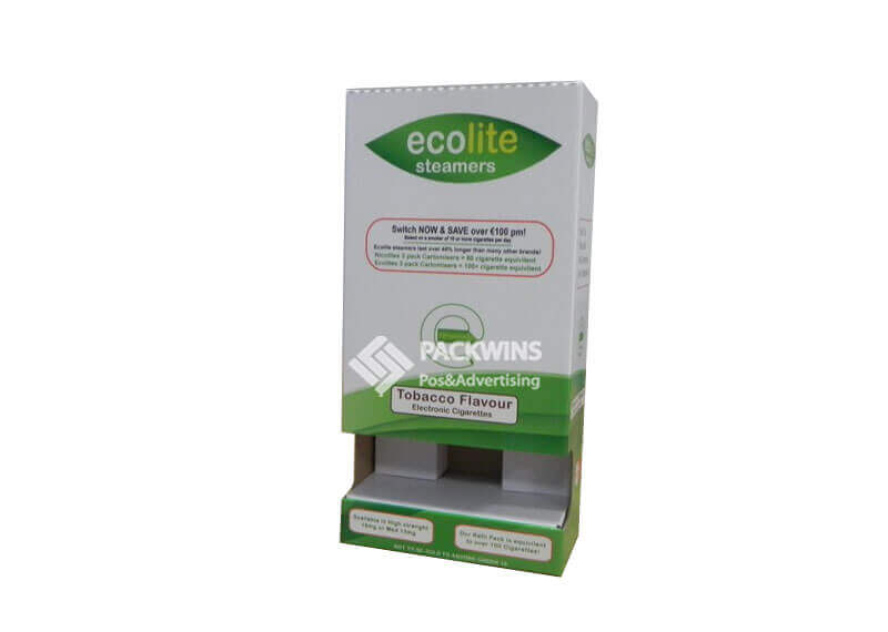
I always insist that my clients take printed prototypes to an actual store. We place them on the shelf, next to competitors, and step back 10 feet. Does it still pop? Can you read the brand name? We look at it from different angles, under harsh lighting. I once had a beauty product with a stunning, subtle color palette that looked incredible in the design studio. But in the store, it completely washed out and looked gray. We had to increase the color saturation significantly to make it viable. This real-world testing11 is non-negotiable. It's how you discover that your carefully placed claims are obscured by a channel strip or that your material reflects glare, making the text unreadable. This is especially true for big-box stores, where products are often stacked high on pallets and need to be visible from a distance.
- Design Risk: Designing in a vacuum is the core issue here. What looks perfect on a high-resolution monitor rarely translates directly to a physical retail environment.
- Production Risk: The chosen materials might behave unexpectedly. A glossy finish could create too much glare, while a matte finish might make colors appear duller than intended once they are under store lighting.
- Retail Risk: If the packaging isn't visible or legible from a typical shopping distance, it has failed its primary job. Shoppers won't walk up to every single product to examine it; you have to grab their attention from afar.
Do They Align Packaging with Shelf Strategy and Displays?
Your new package is ready, but you haven't thought about how it will be merchandised. The package and the POP display5 feel like they were designed by two different teams, creating a disjointed experience.
Successful redesigns consider how the packaging will work in harmony with shelf placement and Point-of-Purchase (POP) displays from the very beginning. The package and the display should be treated as a single, cohesive marketing unit.

I worked with a snack food company launching a new line of chips, and we designed the packaging and the corrugated floor display simultaneously. The bold, diagonal stripes on the bag were carried over to the display's header and side panels. This created a powerful, unified brand statement in the aisle that was impossible to ignore. For a beauty brand's endcap display, we ensured the product tiers were perfectly sized to hold the uniquely shaped bottles, preventing them from tipping over and always facing forward. In the CBD world, displays often need to do double duty—merchandising and educating. The packaging and display messaging must be perfectly aligned to guide the customer. For big-box pallet displays, the packaging's structural integrity is paramount to ensure it can be safely stacked and shopped down.
- Design Risk: When packaging and displays are designed in separate silos, the result is often a visual mismatch that weakens the overall in-store impact.
- Production Risk: A critical failure point is a physical mismatch between the package and the display. If the packages don't fit securely into the display trays or pockets, the result is a messy, disorganized presentation that deters shoppers.
- Retail Risk: A poorly coordinated strategy leads to missed merchandising opportunities. You lose the chance to create a powerful brand block6 and make a significant impact in the aisle, ultimately hurting sales.
Do They Execute Consistently from Design to Production to Store?
The approved design was perfect, but the product that showed up in stores was a disappointment. Color variations and printing errors have created a messy, unprofessional look on the shelf.
Consistency across every stage—from design to manufacturing to the retail rollout—is what separates winning redesigns from costly failures. Excellence in execution is just as important as the creative idea itself.

I cannot stress this enough: the handoff from the design team to the production facility is one of the most critical moments in a redesign. I've seen projects stumble here because of poorly specified color codes or miscommunicated printing requirements. For a national CBD brand, we had to ensure that the legally required text was perfectly legible on every single package, regardless of which facility printed it. For a big-box retailer, ensuring that every pallet display is assembled correctly in every store is a massive logistical challenge. A successful redesign requires rigorous quality control12 at every step. This includes press checks at the printer, clear assembly instructions for displays, and a well-managed retail rollout plan. Without this commitment to consistent execution,even the most brilliant design concept will fail.
- Design Risk: A poor handoff, with incomplete specs or a lack of clear communication between the designers and the production team, is a recipe for disaster.
- Production Risk: Batch-to-batch inconsistency is a major problem. If the colors on the packages printed in May don't match the ones printed in July, your brand presence on the shelf will look fragmented and unprofessional.
- Retail Risk: An uneven or sloppy in-store execution can completely undermine the entire redesign effort. If displays are set up incorrectly or the old and new packaging are mixed on the shelf, it creates confusion for shoppers and damages brand perception.
Understanding best practices for package redesign can help ensure your product stands out on the shelf and maintains brand recognition. ↩
Exploring how retail conditions impact packaging can help you design products that perform well in real-world environments. ↩
Explore common design risks to avoid during a packaging redesign to ensure your product stands out. ↩
Discover how visual cues can enhance product findability and strengthen brand identity on the shelf. ↩
Explore how POP displays can enhance product visibility and reinforce brand messaging in-store. ↩
Learn how creating a brand block can enhance product visibility and strengthen brand identity on the shelf. ↩
Avoid the pitfalls of over-redesigning by understanding how it can alienate customers and dilute brand equity. ↩
Learn how visual hierarchy can help communicate the most important product benefits at a glance. ↩
Explore ways to evolve brand assets like logos and colors to maintain a consistent brand story. ↩
Discover how consumer insights can guide packaging redesign to better meet customer expectations and preferences. ↩
Discover the importance of testing packaging in real retail environments to ensure it performs as intended. ↩
Find out how rigorous quality control ensures your packaging meets design specifications and maintains brand integrity. ↩

