Struggling with packaging that underperforms? The real cost isn't the design fee; it's the lost sales from small mistakes. I've seen brands fail by ignoring details that make or break retail success.
The true cost of packaging design1 isn't found in freelance quotes or agency fees, but in the downstream consequences of overlooked details. Seemingly minor decisions about typography, color, materials, structure, and function2 directly impact production efficiency3, logistics costs4, retail performance5, and ultimately, your brand's profitability6.

You see a beautiful box on your screen, ready to go. But you're worried. Will it look the same after a run of 100,000 units? Will it survive a cross-country trip in a humid container? Will a retail worker even be able to stack it properly? These are the questions that keep brand managers up at night, and they all come down to getting the small details right from the very beginning. In my years of executing packaging and retail displays, I've learned that the most expensive design is the one that fails in the real world. Let’s break down the details that truly determine your packaging's cost and success.
How do typography, spacing, and hierarchy influence brand perception?
Confused shoppers don't buy. If your packaging message is jumbled, customers will walk away, assuming the product is just as chaotic. I've seen great products get ignored because of this.
Typography, spacing, and visual hierarchy7 are critical tools that guide a shopper's eye, making them understand your product's value in seconds. Poor hierarchy doesn't just look bad; it creates confusion at the shelf, which directly erodes a customer's trust in your brand.

I believe great packaging design1 is about instant communication. A customer should be able to glance at your product and immediately understand what it is, who it's for, and why they should buy it. This is where typography and hierarchy become your silent salespeople. When executed well, they create a smooth path for the eye, leading from the brand name to the key benefit, then to supporting details. But when these elements are treated as an afterthought, it creates a visual mess that sabotages your retail performance5. I've seen firsthand how tiny font decisions made in a design studio can lead to massive problems on the production line and on the store shelf, turning a promising product into a clearance-bin failure.
- Design Risk: The primary risk at the design stage is creating an overcrowded layout. Designers, in an effort to include every possible feature and benefit, often cram text and graphics together. This dilutes the core brand message and makes it impossible for a shopper to quickly grasp the product's unique selling proposition.
- Production Risk: What looks crisp on a high-resolution monitor can become a blurry mess on a corrugated box. Fine, delicate typography often loses its clarity and legibility during the printing process, especially on texture8d materials. This seemingly small production issue can make your packaging look cheap and unprofessional.
- Retail Risk: The ultimate risk is that shoppers simply overlook your product. In a crowded retail environment, a package with a weak visual hierarchy7 blends into the background. If the key information isn't immediately scannable, the customer will move on to the next option without a second thought.
- Real-World Example: I once worked with a snack brand that had a fantastic, healthy product. Their design agency created a beautiful package with elegant, thin fonts and lots of benefit callouts. In the PDF, it looked amazing. But once printed on the matte-finish flexible pouch, the text was nearly unreadable under harsh store lighting. Sales were dismal until we redesigned with a clear, bold hierarchy that prioritized the brand name and the primary flavor cue.
- POP Adaptation: This issue gets magnified on large-format cardboard displays. A cluttered design on a small box becomes an overwhelming and unreadable disaster on a large Point-of-Purchase (POP) display. The best strategy is to use the large space to reinforce a single, clear message with bold typography and a clean hierarchy, making it visible from across the aisle.
Why do color accuracy9 and finish details10 affect trust and shelf appeal?
Your brand color is off, even slightly. A customer sees it, feels a flicker of doubt—is this a knock-off?—and moves on. This happens more often than you'd think.
Color accuracy and finishes are not just aesthetic choices; they are pillars of your brand's credibility on the shelf. Even minor shifts in color between production runs can weaken your brand's impact and make customers question its authenticity and quality.
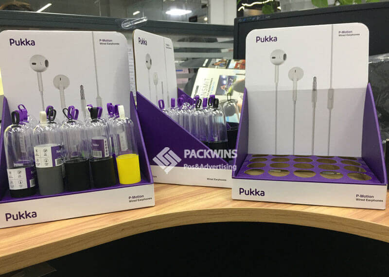
In my experience, color is one of the most powerful non-verbal communicators in retail. It evokes emotion and is often the first thing a customer recognizes about your brand. Think of Coca-Cola red or Tiffany blue. That color is their promise. When your packaging color is inconsistent, it breaks that promise. It suggests a lack of attention to detail, which customers then project onto the product itself. Finishes like a matte varnish or a spot gloss aren't just decorative; they signal quality and create a tactile experience. Getting these details right is non-negotiable for building a premium brand perception and earning shopper trust.
- Design Risk: A common mistake is choosing brand colors on a screen without considering how they will reproduce on a specific substrate under real retail lighting. A vibrant PMS color chosen under office fluorescents can look dull and washed out under the LED lights of a supermarket.
- Production Risk: The biggest production risk11 is inconsistency across batches. Without strict color management protocols, the color of your packaging can vary from one print run to the next. This often happens when switching suppliers or rushing a job, leading to a mismatched and unprofessional look on the shelf.
- Retail Risk: In the store, brand inconsistency erodes shopper confidence. When a customer sees two versions of your product side-by-side with slightly different shades of your brand color, it can create hesitation and doubt about the product's legitimacy, ultimately leading to a lost sale.
- Real-World Example: A luxury beauty brand I consulted for was struggling with this exact issue. Their signature deep purple looked perfect on their rigid boxes but appeared faded and slightly brown on their flexible tubes. This inconsistency made the product line feel disjointed and less premium. We solved it by creating a new color standard specifically calibrated for different printing processes and materials, ensuring consistency across all packaging formats.
- POP Adaptation: Corrugated displays offer a fantastic opportunity to make your brand color pop at the retail level. The large, flat surfaces of a cardboard display can amplify the contrast and impact of your brand colors, making them visible from a distance and drawing customers to your product section.
What is the impact of material choice12 and texture8 on user experience?
Your packaging looks premium, but it feels flimsy. The customer holds it, and their perception of quality instantly drops. That tactile first impression is everything.
The choice of material and its texture8 are the first physical interactions a customer has with your product, shaping their perception of its quality, sustainability, and overall value. A package's feel can communicate luxury or cheapness before the customer even reads a word.

I've always said that customers "buy with their eyes, but they trust with their hands." The tactile experience of packaging is incredibly powerful. A soft-touch finish on a cosmetic box can convey elegance, while a texture8d, recycled paper for an organic food product communicates authenticity and a commitment to sustainability. The weight and rigidity of the material also send strong signals. A flimsy, thin carton suggests a low-quality product inside, while a sturdy, well-constructed box implies the opposite. This physical experience is a critical part of the brand story and can be the deciding factor in a competitive market.
- Design Risk: The most significant design risk13 is choosing materials based purely on aesthetics without considering their real-world performance. A designer might select a beautiful, uncoated paper stock that looks fantastic in a render but is easily scuffed, stained, or crushed during shipping and handling.
- Production Risk: During transit and warehousing, poorly chosen materials can fail spectacularly. I've seen cartons made from the wrong paperboard grade deform under humidity, causing stacks to lean and collapse. Adhesives can also fail, leading to boxes popping open before they even reach the store.
- Retail Risk: When damaged packaging arrives at the store, it's often discarded or discounted. This directly impacts your bottom line and lowers the perceived quality of your brand. Shoppers are hesitant to buy a product in a dented or torn box, assuming the product inside might also be compromised.
- Real-World Example: A craft beverage company decided to use a thin, recycled paperboard for their 4-pack carriers to emphasize their eco-friendly positioning. While the intention was good, the carriers couldn't handle the condensation from refrigerated shelves. They became soggy and weak, often tearing when customers picked them up. This led to dropped products and a negative customer experience until they switched to a more durable, moisture-resistant board.
- POP Adaptation: Cardboard displays provide an excellent way to extend the tactile branding of your primary packaging. By using similar texture8s or finishes on the display as you do on the product package, you create a cohesive and immersive brand experience for the shopper.
How do structural details improve protection, stacking, and handling?
Your beautiful packaging design1 gets crushed in transit. The product is damaged, the retailer refuses the shipment, and your launch is a disaster. It all started with a weak structure.
Structural integrity is the unsung hero of packaging design1; it dictates whether your product survives the journey from the factory to the customer's hands. Details like flute direction, reinforcements, and locking mechanisms determine if a package can withstand shipping, stacking, and retail handling.
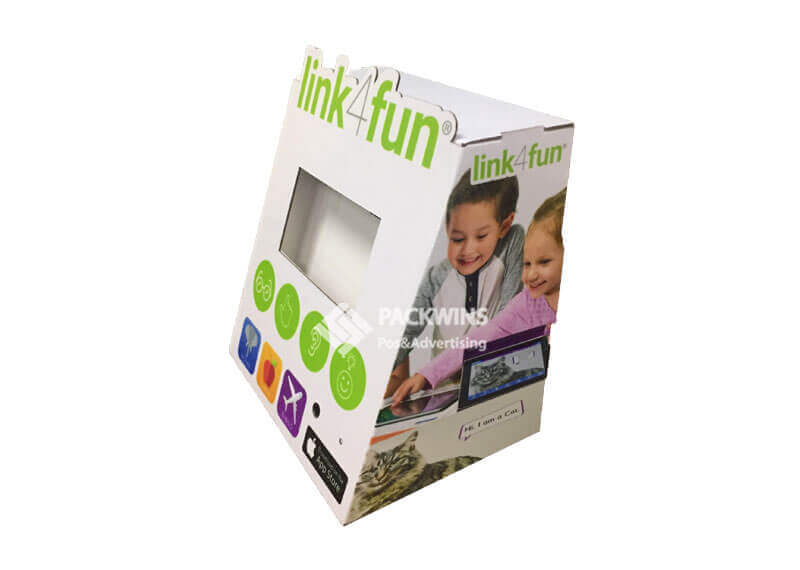
I think of structural design as the skeleton of the package—without a strong one, the whole thing falls apart. It's not just about preventing damage; it's about efficiency and safety throughout the supply chain. A well-designed structure allows for stable pallet patterns, maximizing truck and container space. In the retail store, it ensures products stack neatly and safely on the shelf or in a display. I've seen too many brands focus all their energy on the graphics only to have their products fail because the box couldn't handle the weight of the units stacked on top of it. A collapsed stack is not only lost revenue; it's a safety hazard and a quick way to lose a retailer's trust.
- Design Risk: The key risk here is ignoring the physical forces the package will encounter. Designers often create a dieline that looks good visually but fails to account for compression strength requirements or potential impact points during shipping.
- Production Risk: During the packing process, weak structures can cause major bottlenecks. Boxes that are difficult to assemble or that collapse on the production line slow down fulfillment and increase labor costs. Incorrect scoring or die-cutting can lead to structural failures at the corners and folds.
- Retail Risk: In a retail setting, structurally unsound packaging is a huge problem. Unstable products are often removed from the shelf by store staff for safety reasons. This means zero visibility and zero sales. Furthermore, products that are difficult for staff to unbox and stock are often neglected.
- Real-World Example: An e-commerce brand selling glass-bottled sauces designed a seemingly perfect shipper box. However, they didn't include proper internal partitions. During transit, the bottles knocked against each other, resulting in a nearly 30% breakage rate. The cost of returns and replacements was enormous until we re-engineered the internal structure with corrugated inserts to properly cushion and separate each bottle.
- POP Adaptation: The principles of structural integrity are even more critical for corrugated POP displays. These displays must be strong enough to hold significant product weight for weeks or even months. A well-engineered display improves stability and safety, making retailers more likely to give it a prime location in the store.
Why do functional details14 shape customer satisfaction15 and repeat purchases16?
A customer struggles to open your product, spilling it everywhere. That frustration is now their main memory of your brand. You've likely lost them forever.
Functional details like the ease of opening, the ability to reseal, and simple handling are what transform a one-time sale into a loyal customer. These usability features directly impact customer satisfaction15 and are a major driver of repeat purchases16.

As a packaging expert, I know the customer's journey doesn't end at the checkout. The "unboxing" and usage experience is where brand loyalty17 is truly built or broken. Is the package easy to open, or does it require tools and create a mess? Can it be resealed to keep the product fresh? Does it pour cleanly? These may seem like small things, but they are huge factors in how a customer feels about your product. A positive, frustration-free experience makes them feel smart and valued. A negative one creates a lasting bad impression that no amount of clever marketing can erase. Positive online reviews often mention functional packaging, while negative ones almost always highlight frustrations.
- Design Risk: The primary design risk is prioritizing aesthetics over usability. A designer might create a sleek, minimalist box with no obvious way to open it, or a pouch with a tear-notch that's too small, leading to customer frustration.
- Production Risk: At scale, functional elements can become a major point of failure. Zippers on pouches can be misaligned, perforated tear strips can be cut too deep or too shallow, and spouts can be glued improperly. Any of these small production errors can render the functional feature useless across an entire batch.
- Retail Risk: In the long run, poor functionality leads to negative customer reviews and reduced sell-through. If a product is known to be difficult to use, shoppers will actively avoid it. This can lead to retailers reducing orders or delisting the product altogether.
- Real-World Example: A cereal company launched a new granola in a bag with a press-to-seal zipper. The design was intended to be premium, but the zipper was notoriously difficult to align and close properly. Customers complained online that the product went stale quickly. Sales suffered until they switched to a more reliable and user-friendly zipper track.
- POP Adaptation: A POP display can be an excellent tool to communicate your product's functional benefits. You can use graphics and even physical demos to show customers how easy your package is to open, pour, or reseal. This helps justify a premium price and sets you apart from competitors with less user-friendly designs.
How can overlooked production and logistics details break great designs?
Your packaging is designed to perfection, but it doesn't fit the shipping pallet correctly. This leads to wasted space, higher freight costs, and damaged goods. This is a silent profit killer.
A packaging design is only successful if it works within the realities of production and logistics. Details like palletization efficiency, container loading, and the ease of store replenishment are often overlooked in the creative phase, but they can completely break an otherwise great design.
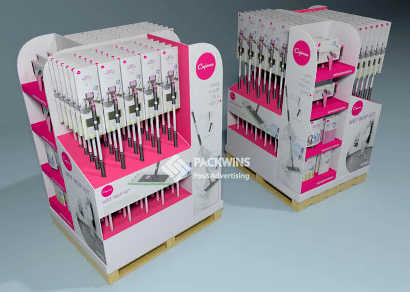
I've seen more brilliant designs fail because of logistics than for any other reason. A designer creates a uniquely shaped bottle that wins awards, but it can't be packed efficiently, causing shipping costs to skyrocket. Or a retail box is designed without considering how it will fit into a master case, leading to wasted warehouse space and difficult handling for store employees. Thinking about logistics from the very beginning is crucial. You have to design for the entire system, not just for the shelf. This means understanding pallet dimensions, truck heights, and how retail staff actually handle your products. Getting this right saves a massive amount of money and prevents huge headaches down the line.
- Design Risk: The biggest risk is designing in a vacuum without input from operations or logistics teams. This leads to package dimensions that don't optimize pallet space, resulting in "shipping air" and dramatically increased freight costs.
- Production Risk: Inefficient packaging designs can create chaos on the production line. A box that requires complex folding or excessive taping slows down the entire packing process, increasing labor costs per unit. This can make the difference between a profitable product and an unprofitable one.
- Retail Risk: If your product is difficult for retailers to receive, store, and shelve, it will not be a priority for them. Shipments that arrive damaged due to poor palletization may be rejected outright. This can lead to out-of-stocks, lost sales, and a strained relationship with your retail partners.
- Real-World Example: A beverage company designed a tall, slender can that looked great. However, its height-to-base ratio made it unstable. When palletized, the stacks were prone to tipping, leading to significant product loss during transit. They had to invest in expensive, custom-designed trays to stabilize the pallets, an expense that could have been avoided by slightly adjusting the can's dimensions early on.
- POP Adaptation: This is where flat-packed cardboard displays are a game-changer. They are designed specifically to reduce logistics risks. They ship efficiently, take up minimal warehouse space, and are easy for store staff to assemble, making retailers much more likely to approve and use them.
Small Details vs. Big Business Impact
| Detail Area | Design Risk | Production Risk | Retail Impact |
|---|---|---|---|
| Typography | Poor readability | Print clarity loss | Low shopper conversion |
| Color | Weak shelf contrast | Inconsistent batches | Brand confusion & mistrust |
| Material | Wrong tactile feel | High damage rates | Lower perceived quality |
| Structure | Potential for collapse | High waste & inefficiency | Product removed from shelf |
| Function | Poor usability | Feature failure at scale | Bad reviews, no repeat buys |
| Logistics | Pallet inefficiency | Increased shipping costs | Damaged deliveries, missed launches |
The Critical Link: Retail Packaging and POP Displays
I cannot stress this enough: your packaging details must scale from the individual product to your large-format Point-of-Purchase displays. The two are not separate projects; they are part of one cohesive retail strategy. Cardboard and corrugated displays essentially magnify every small design decision you make. A slightly fuzzy font on your box becomes an unreadable blur on a large header card. A color that's a shade off on your primary pack creates a jarring inconsistency when placed next to a display printed with the correct brand color.
Retailers see this every day. They favor displays that are structurally sound, easy to assemble, and that reduce their handling time and failure risk. They don't have time for displays that might collapse or products that are a pain to stock. This is why integrated planning is so crucial. When you design your product packaging and your POP display together, you can anticipate and solve these problems before they cost you money and damage your relationship with retailers. A brand that delivers a product and a display that work seamlessly together is a brand that retailers want to work with.
Understanding effective packaging design can help you avoid costly mistakes and improve your product's retail success. ↩
These elements are crucial in determining the efficiency, cost, and success of your packaging. ↩
Learn how design choices can streamline production and reduce costs. ↩
Discover how smart packaging design can minimize logistics expenses. ↩
Explore how packaging can enhance or hinder your product's success in retail environments. ↩
Find out how packaging decisions can directly impact your bottom line. ↩
A strong visual hierarchy can guide customers and improve brand perception. ↩
Texture influences customer perception and can enhance the tactile experience. ↩
Color accuracy is vital for maintaining brand consistency and customer trust. ↩
Finish details can enhance the perceived quality and appeal of your product. ↩
Understanding production risks can help ensure your packaging maintains quality and effectiveness. ↩
The right material choice can improve durability and customer satisfaction. ↩
Identifying design risks can help prevent costly errors and improve product success. ↩
Functional details can enhance usability and encourage repeat purchases. ↩
Satisfied customers are more likely to become repeat buyers, boosting your brand's success. ↩
Discover which packaging features can turn one-time buyers into loyal customers. ↩
Effective packaging design can strengthen brand loyalty and increase customer retention. ↩

